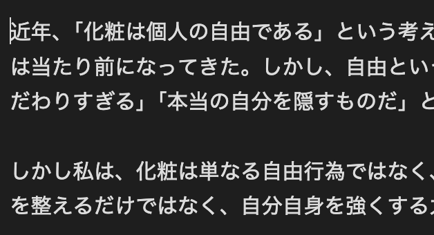
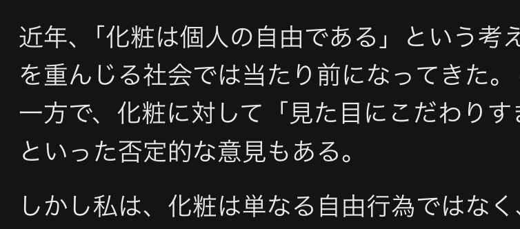
After rebuilding my Obsidian + AWS S3 setup, the typography immediately felt off.
Text looked less crisp than in Affine, and even after several configuration tweaks it still appeared slightly heavy and blurred.

Obsidian font rendering

Affine font rendering
Comparing the CSS revealed that Affine ships with the following properties:
body {
    -webkit-font-smoothing: antialiased;
    -moz-osx-font-smoothing: grayscale;
}
This appears to be the source of the difference.
Why Font Rendering Differs
Font perception changes noticeably with subtle adjustments. Even small discrepancies can make text feel hard to read or slightly fuzzy. Key factors include:
- Font fallback
When Japanese and Latin characters mix, the system substitutes additional fonts. Unintended mixes break visual consistency. - Rendering engine
Obsidian and Affine both rely on Chromium, yet fine-tuning—through CSS overrides or application defaults—leads to different results. Affine seems to take extra steps here. - Line spacing
Tight leading makes text feel cramped. Affine introduces breathing room with values such ascalc(1em + 8px), which improves readability. - Hinting and subpixel rendering
This has the largest impact. Operating systems implement antialiasing differently, changing perceived sharpness.- Obsidian: defers to the operating system in most cases
- Affine: explicitly sets antialiasing through CSS (for example,
-webkit-font-smoothing)
These elements combine to define the final look. Adjusting font-smoothing, text-rendering, line spacing, and font families in CSS can therefore yield significant improvements.
Subpixel Rendering
Each pixel on a display is composed of red, green, and blue subpixels. Rendering text at the subpixel level effectively increases the perceived resolution, letting fine strokes and small characters appear smoother. The main benefits and trade-offs are:
- Advantages
- Produces smoother edges and improves legibility for small text
- Preserves fine detail with greater clarity
- Drawbacks
- Can introduce slight color fringes near glyph edges
- Loses effectiveness—and may even blur—when text is rotated or scaled
- Depends on the panel type and the OS rendering pipeline
Because of these trade-offs, toggling subpixel rendering based on context is practical.
The platform landscape can be summarized as follows:
| System | Approach |
|---|---|
| macOS | Prioritizes grayscale since Big Sur |
| Windows | ClearType relies on subpixel rendering |
| Linux | FreeType allows RGB/BGR mode selection |
Font Hinting
Hinting encodes rules within the font to align strokes with the pixel grid at small sizes, heavily influencing perceived sharpness and weight.
- Enabled
Strokes snap to the grid and look crisp. Dense characters such as kanji benefit, though fine design details may be lost. - Disabled
Glyphs retain their original curves and remain smooth, but small text can appear soft. This often suits larger Latin headings.
As a guideline, try enabling hinting for compact body copy and disabling it for larger headings. Displays and OS rendering stacks differ, so always validate with real output.
My Obsidian CSS Adjustments
After experimenting with multiple options, adding a custom snippet produced the most reliable results. I inserted the following under Appearance → Snippets:
body {
  --font-text-override: 'Inter', 'LXGW Wenkai', 'Noto Sans SC', 'Noto Sans JP', sans-serif;

  -webkit-font-smoothing: antialiased;   /* macOS: rely on grayscale rendering */
  -moz-osx-font-smoothing: grayscale;    /* Firefox: same behavior */
  text-rendering: optimizeLegibility;    /* Improve kerning and ligatures */

  --h1-weight: 600;
  --h2-weight: 600;
  --h3-weight: 500;
  --h4-weight: 500;
  --h5-weight: 500;
  --h6-weight: 500;

  --h1-size: 2em;
  --h2-size: 1.602em;
  --h3-size: 1.424em;
  --h4-size: 1.266em;
  --h5-size: 1.125em;
  --h6-size: 1em;

  --inline-title-weight: 700;
  --inline-title-size: 2.2em;

  --line-height-normal: calc(1em + 8px);

  --font-normal: 400;
  --p-spacing: 1.2rem;
}
With the snippet applied, text became noticeably sharper and the extra line height restored the same sense of balance I see in Affine.
Summary
If Obsidian’s typography feels heavy or slightly blurry, consider the following adjustments:
- Add
font-smoothingandtext-renderingproperties via CSS - Revisit line spacing and the font stack to maintain consistency
The improvements are especially visible on macOS, where text quickly looks more refined. Tailor the values to your environment and iterate until the rendering matches your preferences.